Technical analysis can seem complex at first, with its myriad charts and indicators, but it’s simply about reading market behavior through price and volume on charts. In futures trading, technical analysis can be a core skill that helps you make informed trading decisions without trying to “predict” the future. Instead of crystal-ball forecasts, you can learn to interpret patterns and probabilities in price action. This article introduces the key principles of technical analysis in the context of futures, covering how to read different chart types, draw trendlines, identify support and resistance levels, and use popular indicators like moving averages, MACD, and RSI. We’ll also discuss how these tools can guide your decisions on futures contracts.
By the end of this guide, you should understand how technical analysis helps capture market psychology through charts and how to apply these techniques to futures trading. Remember, technical analysis doesn’t guarantee profits or exact price targets; it may be able to give you an edge by revealing the market’s trends and momentum. Used alongside sound risk management, it can greatly improve your timing and confidence in futures markets.
1. Understanding Technical Analysis in Futures Trading
What is Technical Analysis? Technical analysis (TA) is the study of price charts and historical market data (like price and volume) to identify patterns or trends that could indicate future movement. Unlike fundamental analysis – which looks at economic factors or company financials – technical analysis assumes that everything that can affect the market is already reflected in the price. In other words, price discounts all known information: from economic news to trader sentiment, it’s baked into the current price. TA focuses on what is happening to price, rather than why. This approach tries to capture market psychology and sentiment by analyzing price trends and chart patterns. For futures traders, who often operate in fast-moving markets, technical analysis is a go-to toolkit for decision-making.
Core Principles: Technical analysis rests on a few key ideas. First, as mentioned, price reflects all information – so charts are a trader’s primary source of insight. Second, prices tend to move in trends rather than random fluctuations. A market in motion (uptrend or downtrend) often continues in that direction until something shifts. Third, history tends to repeat itself – human behaviors and market patterns recur over time. This is why certain chart patterns or indicator signals can hint at what might happen, based on what usually happened in similar situations in the past. These principles apply across all futures markets – whether you’re trading equity index futures, oil,gold, or currency futures – because they all reflect human behavior and supply/demand dynamics.
Not Prediction, but Probability: It’s critical to understand that technical analysis does not predict exact outcomes. Instead, it highlights higher-probability scenarios. Think of it as reading the market’s “body language.” For example, if a price chart shows a strong uptrend, a technical analyst doesn’t know it will continue upward – but the trend suggests it’s more likely to keep rising than to reverse suddenly. In this way, technical analysis is about stacking the odds in your favor, not guaranteeing results. Traders use TA to identify good entry and exit points, manage risk, and react to what the market is doing, rather than to forecast far into the future. This is especially useful in futures trading, where leverage is high and timing is crucial – a small edge in timing can make a big difference.
Why Futures Traders Use TA: Many futures traders rely heavily on technical analysis because futures markets (like E-mini index futures, crude oil, or forex futures) are often very liquid and respond quickly to news. A chart will typically show the impact of an economic report or geopolitical event almost immediately. Rather than analyzing supply/demand fundamentals for each trade, a futures trader can read the chart to gauge the market’s reaction. Technical analysis is also versatile: it works on any timeframe – from 1-minute charts for scalping to daily or weekly charts for swing trading – and it’s applicable whether you trade day sessions only or around the clock (futures trade nearly 24/5). For intermediate traders in NovaBloom’s Level 2 program, TA provides a framework to plan trades within the program’s rules. For instance, if no positions can be held over the weekend, a technical trader might use daily charts to identify a trend during the week, but will close positions by Friday afternoon, avoiding weekend gap risk. In short, technical analysis gives you a way to read the market’s mood and momentum, so you’re trading based on what price is actually doing rather than on hunches or hopes.
2. Reading Price Charts: Chart Types and Timeframes
Price charts are the foundation of technical analysis. They offer a visual timeline of price movement, allowing you to spot trends and patterns at a glance. There are several chart types, but the most common ones you’ll encounter in futures trading are line charts, bar charts, and candlestick charts:
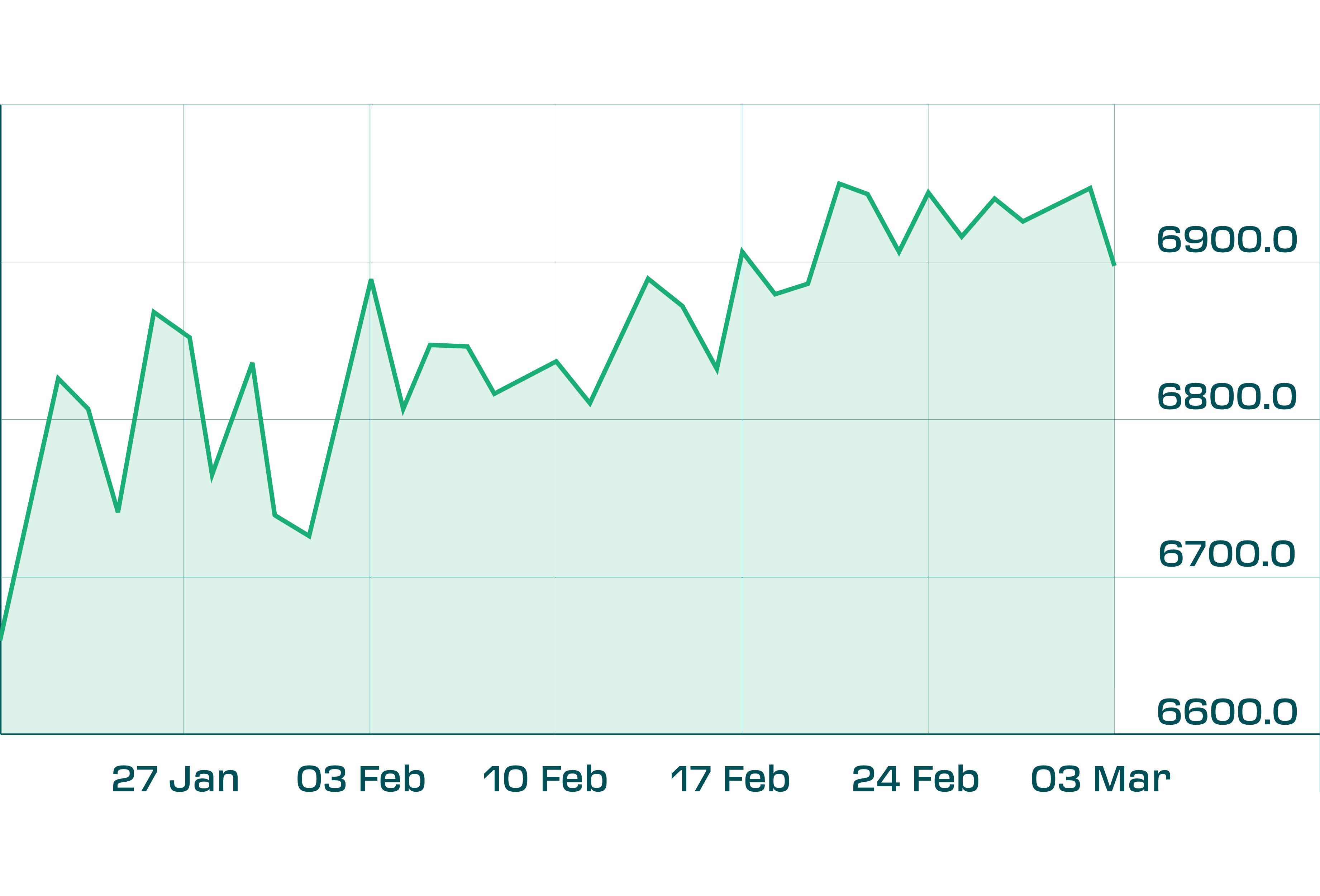
Line Chart
The simplest chart, it connects closing prices over your chosen timeframe (e.g. a line chart of the S&P 500 front-month futures might show each day’s closing price connected to the next). Line charts give a quick overview of the overall trend, but they don’t show intraday swings. They’re useful for stripping out noise and focusing on the bigger picture trend.
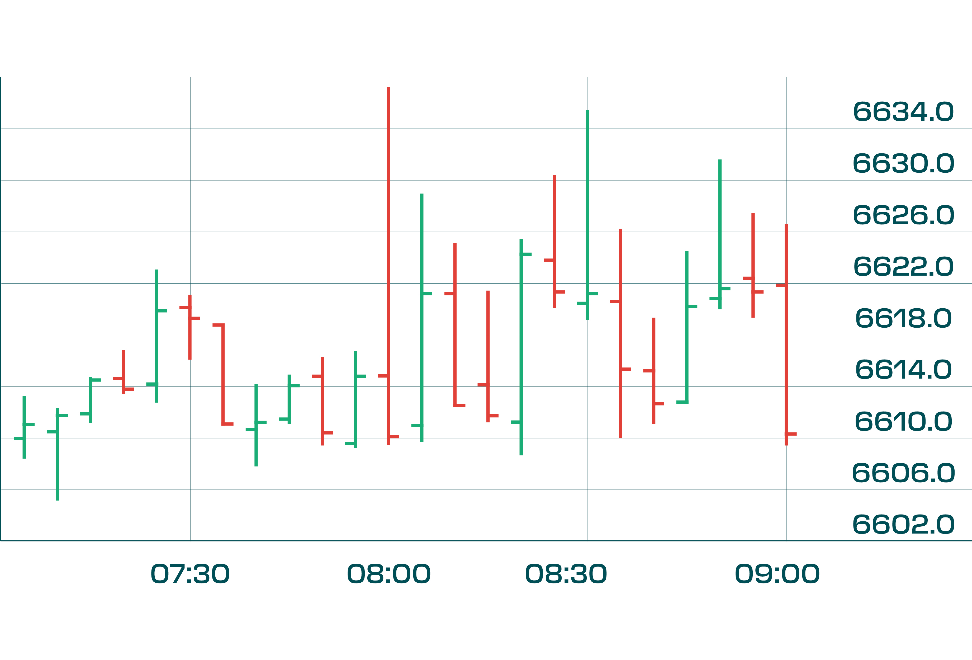
Bar Chart (OHLC Chart)
A bar chart provides more detail. Each time period (say one day, or one hour) is shown as a vertical line (the “bar”) with small horizontal ticks on the sides. The top of the bar is the period’s high price and the bottom is the low; a tick on the left side marks the open price, and a tick on the right marks the close. Bar charts show the full range of trading for each period – useful to see volatility and how price moved within the period. Some traders prefer bar charts, but they can be a bit harder to read at a glance compared to candlesticks.
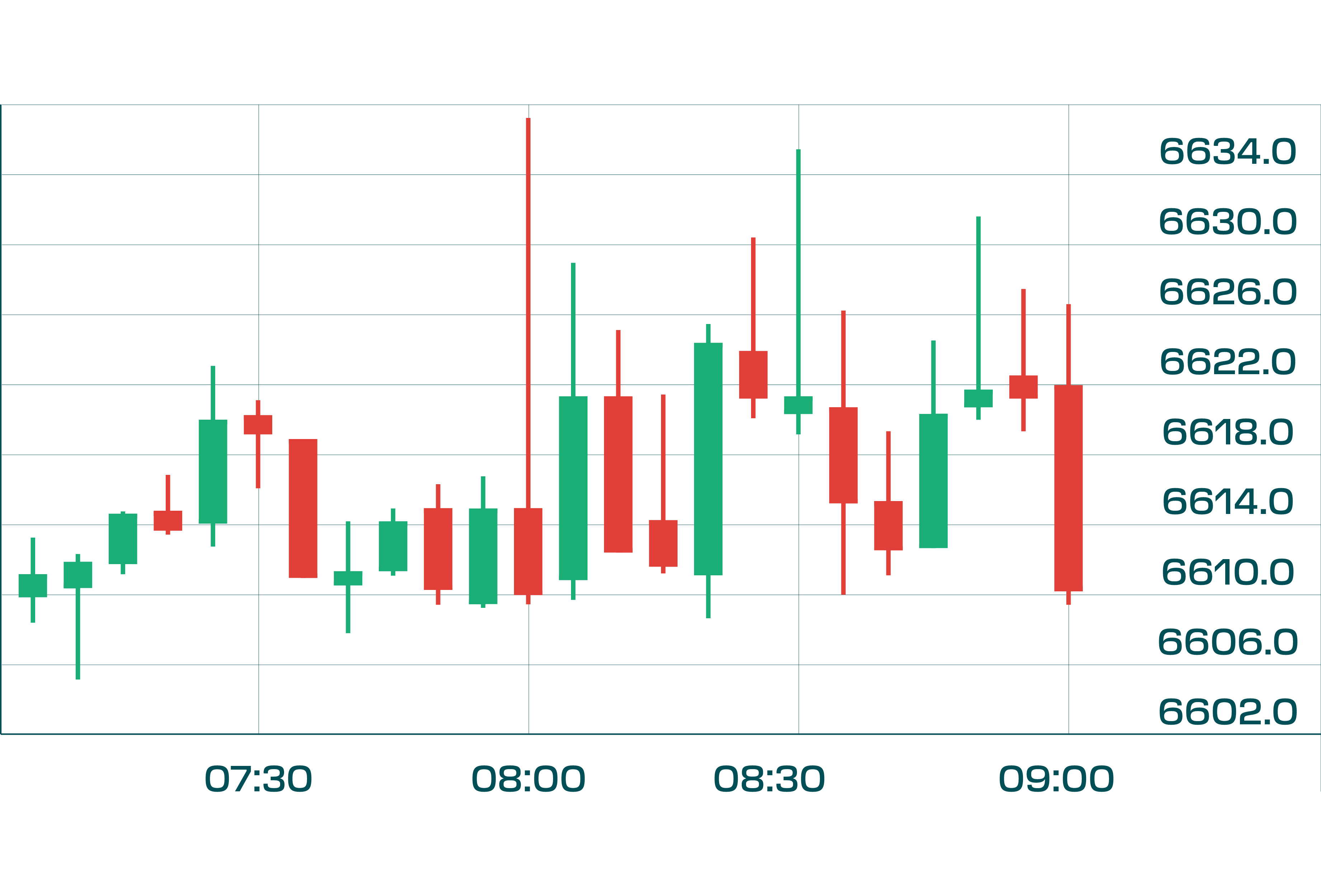
Candlestick Chart
Candlesticks convey the same info as bar charts (open, high, low, close) but in a more visually intuitive way. Each period is represented by a “candle.” The body of the candle is colored (often green for up, red for down) and shows the distance between open and close. Wicks (thin lines) extend above and below the body to show the high and low. Candlestick charts are very popular among technical traders because patterns in candlesticks (like doji, engulfing patterns, etc.) can offer quick insight into short-term sentiment shifts. For example, a long upper wick might indicate that price tried to rally but met selling pressure, potentially a bearish sign.
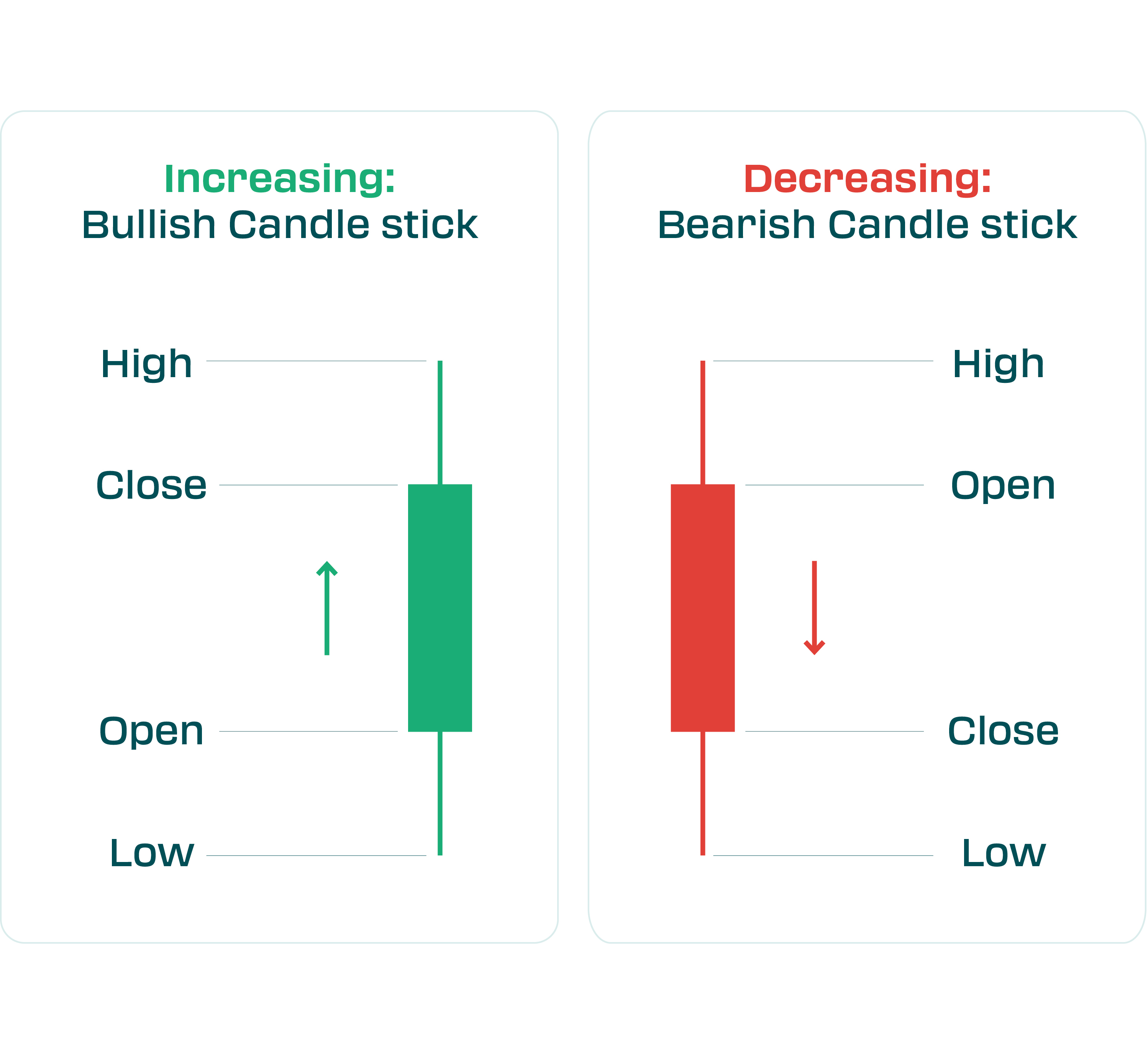
For beginners and intermediate traders, candlestick charts are highly recommended due to their clarity. If you see a series of green candlesticks with higher highs and higher lows, it’s visually clear the market is in an uptrend. Conversely, alternating red and green small candles might indicate indecision or a sideways range. It’s worth taking time to familiarize yourself with common candlestick patterns, as they can add context to your analysis.
Timeframes: Choosing the right timeframe is important. Futures traders have diverse styles – scalpers and day traders might use 1-minute, 5-minute, or 15-minute charts to time entries and exits within the day, whereas swing traders might focus on 4-hour, daily, or even weekly charts to capture multi-day moves. There’s no one “best” timeframe; it depends on your strategy and the NovaBloom program rules (for example, if you aren’t allowed to hold overnight, your trading will naturally gravitate to intraday timeframes).
Good practice can be to use multi-timeframe analysis – using a higher timeframe for context and a lower timeframe for precise entries. For instance, you might check the daily chart of Gold futures to see the overall trend (say it’s upward), then use an hourly or 15-min chart to pinpoint a good entry (maybe a pullback or a small consolidation breakout) that aligns with that uptrend. If you’re day trading the E-mini S&P 500, you might glance at the 1-hour chart to see key levels from the morning, then execute on a 5-minute chart. Always remember to consider when the active trading hours are for your contract (e.g. U.S. stock index futures are most active during the day session of the underlying market). Volume and volatility can vary by time of day. For example, currency futures might be more active during European and U.S. market hours, and quiet in the late afternoon. Align your timeframe and trading activity with periods of sufficient liquidity.
Tip: Stick to the front-month contract chart for analysis. The front-month is the futures contract nearest to expiration and usually has the highest volume. This is where technical patterns are most reliable because the liquidity is there. When a contract is close to expiring and volume shifts to the next month, roll your analysis to the new front-month. Also, note that futures charts can sometimes show price gaps between the last price of an expiring contract and the first price of the new contract; many charting platforms offer continuous charts that adjust for these rolls so you can see a smooth historical price series.
3. Identifying Trends with Trendlines
Trends are the bread and butter of technical analysis – “the trend is your friend” is a famous mantra. A trend means the market has a sustained direction: uptrend (series of higher highs and higher lows), downtrend (lower lows and lower highs), or a sideways trend (ranging between support and resistance with no clear up or down bias). Recognizing the trend is step one in any technical analysis, because many strategies involve trading in the direction of the trend (for higher probability) or identifying when a trend might be ending.
One simple but powerful tool for visualizing trends is the trendline. A trendline is a straight line you draw on the chart to connect at least two significant price points. For an uptrend, you typically draw a line under the price action, connecting a series of higher lows. This ascending line then acts as a support reference – as long as price keeps bouncing above or on this line, the uptrend is intact. In a downtrend, you draw the line on top of the series of lower highs (a descending line above the price), which acts as a resistance reference – the downtrend is intact while price stays below that line.
Drawing good trendlines takes a bit of practice. Focus on obvious swing points – those clear troughs or peaks where price reversed direction – rather than minor intraday price action. Two points are enough to draw a trend line, but the more times price touches the line and respects it, the more valid it is considered. For example, if crude oil futures have bounced off an upward trendline four times over a month, that line is significant. Traders will be watching it, and a break below it could signal a potential trend change.
Using Trendlines: Trendlines not only show you the direction of a trend, but also help in timing entries and exits. In an uptrend, buying near the trendline (on dips) is a common approach – it’s like buying at support in a rising market. Conversely, if you’re in a short position during a downtrend, you might hold it until the price nears the downtrend line, since that line might cause the price to drop again. When trendlines break, it can be an early warning of a trend reversal or at least a loss of momentum. Say the Nasdaq futures have been in a steady uptrend and then fall through the trendline support – that’s a heads-up that bullish momentum is weakening. However, not every trendline break leads to a full reversal; sometimes price will consolidate or form a new shallower trend. It’s wise to combine trendline breaks with other signals (like a change in moving average direction or a momentum indicator confirmation) before deciding the trend is truly reversing.
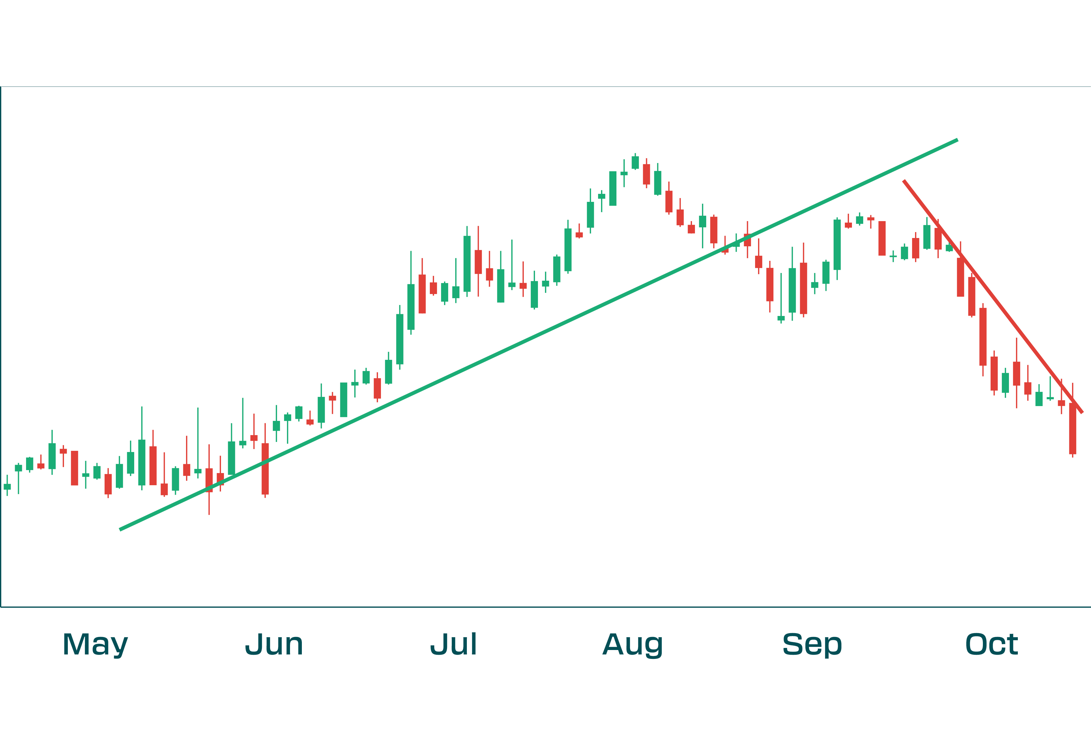
Practical tip: Don’t force a trendline if it doesn’t fit. Sometimes markets are choppy and won’t adhere to a neat line – that’s okay. Trendlines are best used when a market is clearly trending. In rangy or volatile markets, support/resistance levels (horizontal lines) might be more useful. Also, adjust trendlines when needed – if a new obvious swing high or low forms, you might redraw your line to include it, to capture the evolving trend.
4. Support and Resistance Levels
Support and resistance are fundamental concepts that every trader should know. They are horizontal price levels or zones where the market has shown a tendency to stop and reverse.
- Support is a price level on the chart where demand (buying interest) has been strong enough to halt a decline. It’s often thought of as a “floor” where the price bounces. For example, if the price of gold futures drops to around $3,900 several times and each time buyers step in, pushing it back up, then $3,900 is a support level. Traders see it as a relatively cheap or fair price to buy, so demand increases there.
- Resistance is the opposite – a price level where supply (selling interest) has been strong enough to cap advances. It’s like a “ceiling” that prices struggle to break above. If the E-mini S&P 500 futures rally up to 6,200 repeatedly but keep failing to go higher because sellers take profit or new sellers enter at that price, 6,200 is a resistance level.
Support and resistance often form at round numbers (like 40,000 on the Dow, or $100 in oil) or previous major highs/lows on the chart. They can also form where technical indicators cluster (for instance, a moving average might act as dynamic support/resistance if many traders watch it). In futures, since contracts expire, be aware that continuous charts carry over these levels. A support on the December contract will generally still be a support on the March contract (adjusted for any price differences), assuming continuous price action.
Why They Matter: Support and resistance are essentially battlegrounds of buyer and seller sentiment. They are useful for multiple reasons: - They help in planning trades. You might decide to buy near a support level, with the logic that you’re entering where others have historically stepped in to buy, and place a stop-loss just below that support (in case it doesn’t hold). Conversely, you might take profits on a long trade as price approaches known resistance, anticipating that it could struggle to go much higher after there. - They define the trading range when the market isn’t trending. If crude oil is oscillating between $70 support and $80 resistance for weeks, traders might repeatedly buy near $70 and sell near $80 until a breakout happens. - Breakouts occur when price finally moves through a support or resistance level significantly. A breakout above resistance (especially on strong volume) can signal a new up-leg, because an area that used to have lots of sellers was overcome by even stronger buying. Often, old resistance becomes new support after a breakout (and vice versa: a break below support can turn that level into future resistance) – this happens because of trader psychology (those who missed the breakout will try to buy the first pullback to the old breakout level, etc.).
To illustrate, imagine the Euro futures (EUR) had been stuck between 1.0800 and 1.1000 for a month. 1.0800 is support, 1.1000 resistance. A technical trader could buy near 1.0800 with a tight stop just below, and aim to sell near 1.1000. If instead the price rallies and finally closes above 1.1000 with momentum, that’s a bullish breakout – the trader might then switch to looking for buying opportunities, perhaps buying a retracement if the price dips back to ~1.1000 (the old resistance) which now could act as support.
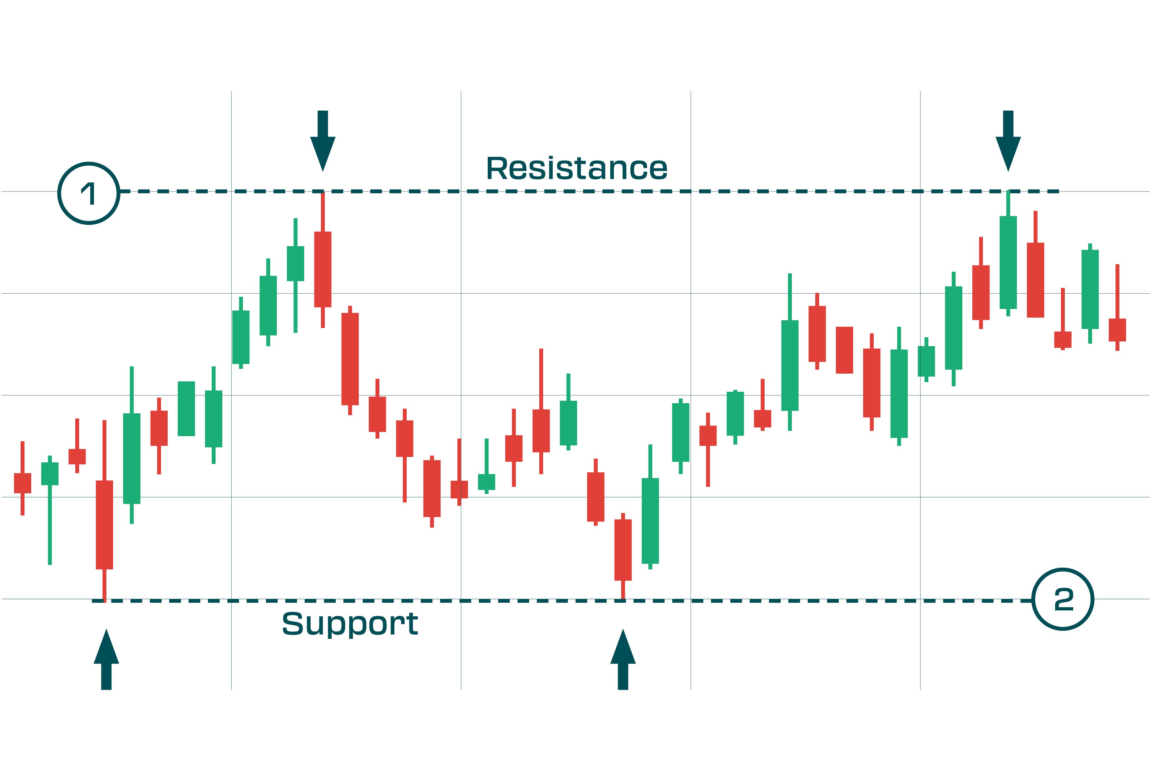
Volume and Confirmation: Not all support/resistance levels are equally strong. A level that has been tested many times is usually more significant. Also, if a break of a level happens on low volume or outside normal trading hours, be cautious – it could be a false breakout. High volume on a breakout adds confidence that the move is real (more on volume in the next section).
Practical tip: Mark major support and resistance from higher timeframes. Even if you trade a 5-minute chart of the NASDAQ futures, knowing the key daily or weekly levels can prevent nasty surprises. For example, if you see on a daily chart that 20,000 is a huge resistance (price has failed there multiple times in recent months), you’d be cautious about initiating new longs as the market approaches 20,000 on your intraday trade – or at least expect some turbulence there. Many successful futures traders plan trades around these levels: perhaps buying near solid support with a tight stop, or fading (shorting) an approach to major resistance if other indicators show weakness.
5. Volume: The Fuel Behind Price Moves
Volume – the number of contracts traded in a given period – is a critical yet sometimes overlooked aspect of technical analysis. Price tells you what moved; volume hints at how significant the move was. In futures, volume data is readily available and is a direct measure of market participation.
Think of volume as the fuel that drives price trends: a strong price move accompanied by high volume means lots of traders agreed on that price move (strong fuel), whereas a move on low volume might indicate it happened in a relatively quiet market (weak fuel), which could make the move suspect or short-lived. Charles Dow (of Dow Theory) noted volume should expand in the direction of the trend – meaning in an uptrend, volume often rises on up days (buyers active) and drops on down days, and vice versa for a downtrend.
Using Volume for Confirmation: Here are some general guidelines technical traders use regarding volume (assuming normal market hours and conditions):
- Price rising + volume rising = Bullish confirmation**. Increased volume on up-moves suggests genuine buying interest. For example, if S&P futures break above a resistance and volume spikes well above average, it’s a good sign that the breakout is real and supported by institutional traders or broad participation. High volume can give a price move “staying power”.
- Price rising + volume falling = Caution (weak rally)**. If the market is drifting up on declining volume, it may indicate lack of enthusiasm. This scenario can happen in “slow” markets or before big news. The trend can still continue, but a low-volume rally is viewed with caution – it might reverse because fewer buyers are participating.
- Price falling + volume rising = Bearish confirmation**. Increasing volume on down-moves shows strong selling pressure. Suppose crude oil prices plunge and volume is the highest in weeks – that suggests a lot of sellers are rushing out (or short-sellers piling in), reinforcing the downtrend’s validity.
- Price falling + volume falling = Weak downtrend or potential reversal**. Decreasing volume on a price drop might mean sellers are losing interest. In a downtrend, if each new low is on smaller volume, it could signal that the down move is running out of steam (bullish divergence). Buyers might step in if they sense the sell-off is exhausted.
These scenarios are sometimes referred to as confirming or diverging volume signals. For instance, a bullish volume divergence occurs when price makes a new low but volume is lower than on the prior low – indicating fewer sellers, which can precede an upward reversal.
Volume Spikes: Another thing to watch is unusual volume spikes. When volume suddenly surges to very high levels, it often marks a climax of activity – sometimes at the start of a breakout move, and other times at the end of an exhaustive move. For example, a huge volume spike on a big down day could mean capitulation (everyone who wanted to sell has sold), after which a rebound may follow. On the flip side, a volume surge on a breakout from a consolidation gives confidence that the price will follow through in the breakout direction.
Volume Tools: Beyond raw volume bars, some traders use Volume Profile (which plots volume traded at each price level) to identify price levels of high interest (potential support/resistance), or VWAP (Volume-Weighted Average Price) as an intraday benchmark to see where most trading occurred (often used by institutions). These are more advanced, but as an intermediate trader it’s good to know they exist. At a minimum, keep an eye on the basic volume histogram on your chart.
Practical tip: If a futures contract breaks a key level on high volume, you could gain more confidence in that move. If it breaks out on tiny volume, be more sceptical – it might be a false breakout that reverses once bigger players return. In NovaBloom’s funded environment, where risk management is paramount, volume can act as a safety check: you’d prefer to participate in moves that the “crowd” (or smart money) is backing, rather than get caught in a head-fake move that you alone seem to believe in.
6. Moving Averages: Gauging the Trend
Moving averages (MAs) are among the most popular technical indicators for traders of all levels. A moving average simply calculates the average price of a futures contract over a specific past period and plots it as a line on the chart. For example, a 50-day moving average on the Dow futures will add up the last 50 days’ closing prices and divide by 50; each day, the oldest data drops off and the newest day’s price is included, so the average “moves” along.
The main purpose of moving averages is to smooth out price fluctuations so you can more easily see the underlying trend. They filter out day-to-day noise, giving a clearer view of the market’s direction. A quick glance at a moving average can tell you if a market is in an uptrend, downtrend, or trading sideways: - When the moving average line is sloping upward, the market is generally in an uptrend; if it’s sloping downward, the market is in a downtrend. The steepness of the slope can indicate how strong the trend is. - If price is consistently above a particular moving average, that MA may act as a support level in an uptrend. If price is below the MA, that MA can act as resistance in a downtrend. - Many traders watch the 50-day and 200-day moving averages (on daily charts) as benchmarks for intermediate and long-term trend. For shorter-term futures trading, common periods are 9, 20, or 50 on intraday charts, but it’s flexible – choose a length that fits your trading horizon.
There are different types of moving averages. The most common are Simple Moving Average (SMA), which weights all periods equally, and Exponential Moving Average (EMA), which gives more weight to recent prices (making it react faster to current price changes). EMAs are popular for short-term trading signals (like the 9 EMA or 20 EMA) because of their responsiveness.
Common MA Strategies: - Trend identification: As mentioned, the MA’s direction shows trend. Some traders will only go long if price is above, say, the 200-period MA (indicating a bullish trend) and only go short if below it. - MA as dynamic support/resistance: In strong trends, pullbacks often halt around a key moving average. For instance, in a steady S&P uptrend, the 20-day or 50-day MA might repeatedly act as a floor for price. Traders set buy orders near the MA, anticipating the next bounce. - Crossover signals: This is a classic system. It involves using two moving averages – one short-term, one longer-term. When the shorter MA crosses above the longer MA, it’s a bullish signal (often called a “golden cross” in longer-term charts), suggesting momentum is shifting up. When the short MA crosses below the long MA, it’s bearish (a “death cross” on longer-term charts), suggesting momentum turning down. For example, a trader might use a 10-period and 30-period MA on a 15-minute chart: if the 10 crosses above the 30, they might buy; if it crosses below, they might sell/short. Crossovers can be effective in trending environments but produce whipsaws in choppy markets, so they’re often combined with other filters (like requiring a volume confirmation or a trend filter). - Mean reversion: Sometimes traders use moving averages as a mean level to which price tends to revert. If price stretches far above a moving average, it could be considered “overextended” and due for a pullback toward the average, and vice versa. This is the basis for indicators like Bollinger Bands (which plot bands X standard deviations from an MA).
For futures traders, moving averages are particularly handy because they can be used on whichever market you apply them on – be it equity indices, commodities, or forex futures. You might notice, for instance, that a certain futures contract respects a particular MA quite well. Perhaps the 20-day EMA is a magnet for the EUR/USD futures price – you see price reverting to it often; this could become a cornerstone of your strategy (e.g., in a range, sell when price is significantly above the 20 EMA and buy when below it, betting on reversion).
Practical tip: Use moving averages as a guide, not a holy grail. They lag price (they’re based on past prices), so by the time an MA confirms a trend change, price has often moved substantially. If you want earlier signals, you’ll need to incorporate other tools. Many traders use MAs in conjunction with oscillators (like RSI or MACD, which we’ll cover next) to get a more complete picture: the MA shows trend direction, the oscillators show if the trend might be weakening or momentum shifting.
In the NovaBloom funded context, moving averages can also help enforce discipline. If your plan is to only trade in the direction of the main trend (to increase win probability), a quick look at, say, the 1-hour and 15-minute MAs can keep you from counter-trend trades. And because funded traders must manage risk tightly, trading with the trend (as identified by MAs) is generally less stressful than constantly picking tops or bottoms.
7. Momentum Indicators: MACD and RSI
Momentum indicators are technical tools that help gauge the speed or strength of price movements. They can warn you when a trend is weakening or when an asset might be overbought or oversold. Two of the most widely used momentum indicators in futures trading are MACD and RSI.
MACD (Moving Average Convergence Divergence)
The MACD is a versatile indicator that blends trend-following and momentum aspects. It’s derived from moving averages: typically, the MACD line = 12-period EMA minus 26-period EMA. A signal line (often a 9-period EMA of the MACD line) is plotted on top of it. The MACD is usually displayed as two lines that oscillate without upper or lower bounds (the MACD line and the signal line), and often a histogram showing the difference between those lines.
How to use MACD:
- Trend Momentum: When the MACD line is above zero, it means the shorter-term EMA is above the longer-term EMA, indicating an upward bias or bullish momentum. MACD below zero indicates a bearish momentum (shorter-term trend is weaker than the longer-term trend). Traders often note when the MACD line crosses the zero line – that can confirm a shift in the broader trend momentum.
- Signal Line Crossovers: This is the classic MACD signal. When the MACD line crosses above the signal line, it’s a bullish signal (momentum turning up). When MACD crosses below the signal line, it’s a bearish signal. Essentially, the crossover is telling you that the difference between the two EMAs is now increasing in the opposite direction, which reflects a shift in momentum. Traders may buy when they see an upward crossover and sell or short when they see a downward crossover. For example, if NASDAQ futures’ MACD line crosses up over the signal line after being below, and especially if this crossover happens below the zero line and starts moving upward, it could be an early sign the downtrend is bottoming and momentum is swinging up.
- Divergence: MACD is great for spotting divergences. Bullish divergence is when price makes a lower low but the MACD line makes a higher low – indicating the downtrend’s momentum is weakening. Bearish divergence is when price makes a higher high but MACD forms a lower high – signaling the uptrend is losing steam. Divergences often precede a trend change or significant pullback, although the timing can be tricky (the market can diverge for a while before turning).
MACD is best used on slightly longer timeframes (many say it’s most reliable on daily charts with standard 12,26,9 settings). On very short timeframes it can be choppy. But many day traders still use a quicker version (like 6,13,5 or so) for intraday signals. It’s a matter of experimentation.
Practical tip: MACD is a lagging indicator (based on moving averages), so by itself it might give signals after a move has begun. That’s why some traders anticipate MACD signals by also reading price action. For instance, if a double bottom forms on the chart and MACD is showing a bullish divergence, they might act before the actual MACD crossover happens, to get in early.
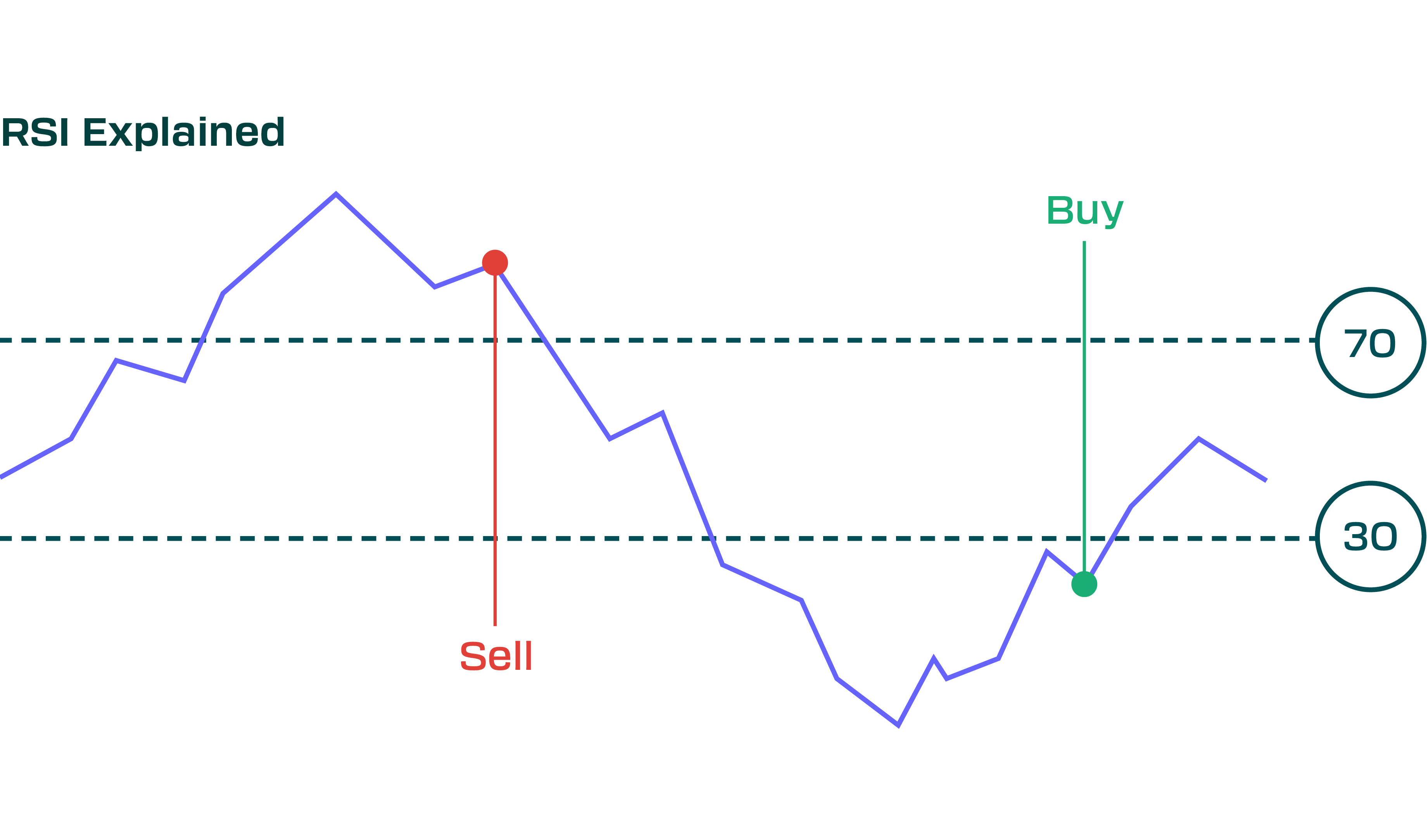
RSI (Relative Strength Index)
The RSI is a momentum oscillator that measures the magnitude of recent gains vs. recent losses over a given period (default is 14 periods) to assess speed and change of price movements. It plots as a line that ranges between 0 and 100.
How to use RSI:
- Overbought/Oversold: RSI is famous for its overbought/oversold indications. Traditional thresholds are 70 and 30. When RSI goes above 70, the asset is considered overbought – meaning it’s had a strong run-up and may be due for a pullback or pause. When RSI goes below 30, the asset is oversold – it’s had a sharp decline and might be due for a bounce. These conditions don’t guarantee a reversal, but they signal the market may have moved too far, too fast in one direction. For example, if the RSI on the S&P 500 futures hits 75 after a multi-day rally, a trader might tighten stop-losses on longs or be on the lookout for a potential correction. If crude oil’s RSI falls to 25 after a big selloff, one might start watching for a bottoming pattern or a bullish catalyst.
- Exit and Entry signals: A common tactic is to wait for the RSI to cross back out of overbought/oversold territory. Instead of shorting the moment RSI goes over 70 (because in a strong uptrend, RSI can stay over 70 for a while), a more conservative approach is to wait until RSI goes above 70 then falls back below 70 – that drop can be an early sell signal. Similarly, a bullish signal might be an RSI that went below 30 (oversold) and then climbed back above 30, indicating momentum is picking up off the lows. These crosses suggest a possible trend change from extreme conditions.
- Divergence: Like MACD, RSI can show divergences. If price makes a new low but RSI makes a higher low (doesn’t drop as much), that’s a bullish divergence – selling momentum is waning, which could foreshadow a rally. Or if price makes a new high but RSI makes a lower high, a bearish divergence – buying momentum is weakening, often preceding a downturn. Divergences on RSI are well-regarded signals, especially on longer timeframes or major chart points.
- Trend context: RSI can also help gauge trend strength. In a strong uptrend, RSI will often oscillate between 40 on the low side and 80 on the high side (i.e., it never even gets down to 30 because buying interest is so persistent, and it frequently goes above 70). In a strong downtrend, RSI might live between 20 and 60 (struggling to get above 60, and often dipping below 30). Some traders adjust their expectations: for example, in an uptrend they might treat RSI reaching 40 as “oversold within an uptrend” (a potential buy zone), and in a downtrend RSI reaching 60 as “overbought within a downtrend” (a potential sell zone). This prevents them from exiting too early in a strong trend just because RSI hit 70 or 30 – context matters.
RSI is quite straightforward and works on any timeframe, but like all indicators it’s not foolproof. In a strong rally, RSI can stay overbought for an extended period as price keeps climbing (if you sold short just because RSI > 70, you could be steamrolled). The remedy is to combine RSI with other analysis: look at chart patterns, support/resistance, or volume to confirm what RSI is suggesting.
MACD vs RSI: Both indicators measure momentum but in different ways. MACD is unbounded and linked to trend-following MAs, so it’s great for seeing changes in trend momentum and timing entry/exit on crossovers. RSI is bounded (0-100) and is great for spotting extreme conditions and shorter-term swings. Many traders use them together: e.g., MACD to judge the general trend momentum (MACD above zero, trend is up; below zero, trend is down) and RSI to pinpoint if the latest swing is overextended. If both MACD and RSI show bearish signs (say MACD histogram declining, MACD line crossing down, and RSI dropping from overbought), that confluence can provide a stronger signal to act.
Practical tip: Don’t overload on indicators. MACD and RSI are two strong choices, and usually, that’s plenty. Adding too many oscillators will often just confuse you with conflicting signals. It’s better to learn a few indicators in depth and understand how they behave with your specific futures markets. For example, you might discover that the RSI set to 9 periods works amazingly for timing entries on the 15-minute chart of the S&P e-mini, or that MACD on the daily for crude oil gives you a good read on the trend. Stick with what adds value. And always remember: indicators are derived from price – price itself (and its patterns) is the most direct information. Use indicators to enhance your price analysis, not to override what the price is plainly telling you.
FAQs
What is technical analysis and how is it used in futures trading?
Technical analysis is the study of price movement and patterns on charts. In futures trading, it’s used to make trading decisions based on market-generated data (price, volume, etc.) rather than economic reports or fundamentals. Traders use tools like trendlines, indicators, and chart patterns to identify trading opportunities. For example, a futures trader might use TA to determine the market’s trend and find a good entry point (say, buying after a pullback in an uptrend). It’s particularly useful in futures because these markets often react quickly to information, and chart patterns can encapsulate those reactions. In short, technical analysis helps futures traders time their entries/exits and manage risk by reading what the market is doing, instead of trying to predict the market far into the future.
Does technical analysis work for all types of futures (indices, commodities, currencies, etc.)?
Yes – the core principles of technical analysis apply to any market with sufficient liquidity. Whether it’s stock index futures, oil,gold, or currency futures, you’ll find that traders draw trendlines, watch support/resistance, and apply indicators in similar ways. All these markets are driven by supply and demand, and human psychology, which is what technical analysis gauges. That said, each market has its quirks. For example, commodities might have seasonal patterns (which could influence technical trends), or certain futures (like cryptocurrencies or some agricultural products) can be more volatile and thus produce more false breakouts. But overall, chart patterns and indicator signals are meaningful across the board. It’s important to ensure you have enough volume and liquidity in whatever futures market you analyze – thinly traded contracts can give unreliable technical signals. Stick to popular contracts (e.g., front-month contracts of major indices, popular commodities, currency pairs) for the most robust technical analysis.
How is technical analysis different from fundamental analysis in futures?
Fundamental analysis looks at underlying factors like economic indicators, interest rates, crop reports, OPEC decisions, etc., to determine where a futures price “should” go. Technical analysis, by contrast, doesn’t concern itself with why the market is moving – it focuses purely on what the price is doing. For example, a fundamental trader in oil might study supply forecasts and geopolitics to decide if oil might rise, whereas a technical trader will look at oil’s price chart, notice an uptrend and a breakout pattern, and buy based on that. One isn’t “better” than the other – they’re just different approaches. Many futures traders actually blend them (e.g., being aware of key fundamentals but timing entries with technicals). However, especially for short-term and intraday futures trading, technical analysis tends to be more practical. Futures prop firms and funded programs often encourage technical strategies because they allow traders to react quickly and manage risk tightly without needing extensive fundamental research. In summary: use fundamental analysis to know what to trade (which market, long or short bias) if you prefer, and technical analysis to know when and where to trade (entry, exit, stop levels).
What chart timeframe is best for futures trading?
There is no single “best” timeframe – it depends on your trading style and goals. If you’re a day trader, you’ll likely use intraday charts: 1-minute or 5-minute charts for quick scalps, maybe 15-minute or 30-minute charts for slightly longer intraday moves. Day traders might also glance at the 1-hour or 4-hour chart to see the bigger intraday trend or key levels from previous days. If you’re a swing trader (holding positions for days), you’d focus more on 4-hour, daily, or even weekly charts to capture multi-day trends. As a general rule, use at least two timeframes: one higher timeframe for context and major trend (e.g. daily), and one lower for entry/exit timing (e.g. hourly or 15-min). For instance, you might see on the daily EUR/USD chart that EUR is in a downtrend, so you then zoom into the 1-hour chart to wait for a shorting opportunity (like a bounce to resistance on that 1-hour chart). In the NovaBloom funded plan context, if you cannot hold overnight, you’ll be mostly trading intraday – so something like a 5-min or 15-min chart for setups, with perhaps a 1-hr chart for the day’s trend, could work well. If you can hold overnight (check the specific rules), you might incorporate daily charts into your analysis for swing trades. Ultimately, choose timeframes where you can comfortably observe and react – and that align with how long you intend to hold a trade.
How can I tell if a futures market is in a trend or just choppy?
Typically,in an uptrend, you’ll see a sequence of higher highs and higher lows on the chart. In a downtrend, it’s lower highs and lower lows. You can also apply a moving average – if price is mostly above a rising moving average (say the 50-period MA) and the MA is sloping up, that’s trending up. If price whips back and forth across a flat moving average, that’s a sideways or choppy market. Drawing trendlines on swing highs/lows can help visualize it too – if a clear upward or downward sloping trendline holds, you have a trend. Perhaps a simpler way to do this is to ask, “Would I draw a fairly straight line through this price action, either up or down? Or is it oscillating in a range?” If it’s rangy and inconsistent, it’s likely choppy. Many futures markets alternate between trends and ranges. If you identify a range (sideways), you might switch to range-bound tactics (buy low, sell high of the range) until a breakout happens, after which you adapt to the new trend.
What are support and resistance, in simple terms, and how do I find them?
Support is a price level where a falling market tends to stop falling and bounce up because buyers step in (demand). Resistance is a level where a rising market tends to stop rising and pull back because sellers emerge (supply). Think of support as a floor and resistance as a ceiling for prices. To find them on a chart, look for price lows that occurred multiple times around the same area – that’s a potential support. Likewise, a cluster of price highs around the same level indicates resistance. Key support/resistance often appear at historic highs or lows, big round numbers which can be psychological levels and grab headlines, or levels that were repeatedly turning points. Previous support that price broke below can become future resistance when price comes back up to that level (this is called support-turned-resistance, or vice versa). Some charting techniques like pivot points or Fibonacci retracements are also used to predict potential support/resistance, but starting with obvious price level observation is best. In practice: if you open a daily chart of a futures contract and draw a horizontal line wherever you see price had a notable peak or trough, you’ll quickly map out the major S/R zones. These are areas to watch for trading opportunities (like breakouts or reversals).
Why is volume important in technical analysis?
Volume tells you how much trading activity is occurring and thus the enthusiasm or conviction behind price moves. It’s often said that “volume confirms price.” For example, if the price of a futures contract breaks out to a new high on high volume, that move has more credibility – lots of traders participated, suggesting a true shift in supply/demand. If the same breakout happened on very low volume, you might suspect it’s a false move that could fizzle (perhaps occurring in an illiquid moment). Volume can also signal turning points: you might see a huge spike in volume at a market bottom (everyone panic selling, marking capitulation, after which the market turns up). Or in an uptrend, if volume starts drying up, it may mean the rally is running out of fuel. Traders use volume patterns to confirm trends (e.g., in an uptrend, volume should generally be higher on up-days) and to validate breakouts (big moves should ideally happen with big volume). In futures, where we don’t have fundamentals like earnings, volume might bea key secondary piece of data besides price itself. It basically adds depth to your analysis – how many contracts changed hands during that price movement?
What do moving averages tell me, and which ones should I use?
Moving averages (MAs) smooth out price data to help you identify the trend direction and potential support/resistance areas. They answer questions like “Is the market generally going up, down, or sideways?” If the price is above a steadily rising moving average, the trend is up; below a falling MA, the trend is down. MAs can also show you the average price over a period, which sometimes acts like a magnet – price often reverts to the mean (moving average) after straying too far. As for which MAs to use: common choices are the 50-period and 200-period on daily charts (widely followed by many traders as medium and long-term trend indicators). On intraday charts, popular ones are 20-period or 21-period (roughly one month on daily, or short-term on intraday) and 50-period. Some day traders use a very short MA like a 9 or 10-period for quick signals, and pair it with a slower one like a 50. You might have heard of the “golden cross” – that’s when the 50-day MA crosses above the 200-day MA, considered a long-term bullish sign (and the opposite, death cross, is bearish). For futures, you can experiment: if you’re trading a 5-minute chart, you might try a 20-MA and 50-MA combination to guide intraday trend. If swing trading, a 50-day and 200-day are good references. EMA (Exponential Moving Averages) vs SMA ( Simple Moving Averages): EMAs react faster to recent price changes,SMAs are smoother and slower. Many traders like EMAs for shorter term and SMAs for longer-term context. Ultimately, use moving averages that make sense for the rhythm of the market you’re trading. If you notice, for instance, that the 20-day SMA is where the S&P repeatedly finds support in an uptrend, that’s a useful MA for you.
What is the MACD indicator, and what about the RSI? How do they differ?
MACD and RSI are both momentum indicators but they work differently:
- MACD (Moving Average Convergence Divergence): This indicator uses two exponential moving averages of price (commonly 12 and 26 period) and looks at their difference. It consists of the MACD line (the difference between those two EMAs) and a Signal line (usually a 9-period EMA of the MACD line). It often appears as two lines that oscillate around zero. MACD is great for spotting trend momentum shifts. Traders watch for the MACD line crossing above or below the signal line as a buy or sell signal. Also, whether the MACD is above or below the zero line tells you bias: above zero indicates the shorter-term average is above the longer-term (bullish momentum), below zero indicates bearish momentum. MACD can be a bit slower since it’s based on moving averages, but it’s powerful for confirming trends and spotting divergences (e.g., price makes a new high but MACD makes a lower high, signaling weakening momentum).
- RSI (Relative Strength Index): RSI is a quicker, bounded oscillator that ranges from 0 to 100. It measures the ratio of up moves to down moves. Its primary use is to identify overbought and oversold conditions. If RSI > 70, the market is generally considered overbought (price may have run up too fast); if RSI < 30, it’s oversold (price may have fallen too fast). RSI often turns ahead of price – for example, it might start declining while price is still rising, warning of a possible downturn soon (another case of divergence). RSI is simpler in that sense: watch 70 and 30 levels, and look for it to cross back under/over those as potential signals. The RSI is typically faster and better for short-term flips, whereas MACD is more about the ebb and flow of trend.
Differences: MACD is unbounded (lines can go as high or low as they want relative to zero) and is more trend-following. RSI is bounded (0-100) and more mean-reverting. MACD might tell you “the trend is strengthening or weakening” based on its histogram or crossovers; RSI tells you “this move might be stretched too far”. Many traders use them together: e.g., MACD confirms “yes, we are in an uptrend momentum” while RSI says “but near-term we’re overbought, maybe wait for a dip”. If choosing one, RSI is often favored for its clarity and simplicity, while MACD is valued for depth of insight into momentum cycles. As an intermediate trader, you can experiment with both and see which resonates with your strategy.
Should I use technical indicators for every trade, or can I trade just from price action?
It’s absolutely possible to trade just from price action (meaning the raw chart patterns, candlesticks, etc. without any additional indicators). Many traders do so successfully by focusing on things like chart patterns, candlestick formations, and support/resistance. However, technical indicators like moving averages or RSI can be helpful complements. They can provide objective measures (e.g., trend direction or momentum) and sometimes signal things not immediately obvious from naked price (like subtle momentum divergences). The key is not to overload. You don’t want to plaster 10 indicators on your chart; that often leads to analysis paralysis. Instead, pick a few that address different aspects: maybe one trend indicator (like a moving average), one momentum oscillator (like RSI or MACD), and maybe volume. Use them in conjunction with price action. For each trade, you might have a checklist: e.g., “Trend? (MA slope up, check), Price pattern? (bullish candlestick pattern, check), Momentum? (RSI turning up from oversold, check). Okay this trade aligns.” There will also be times when price action alone is clear – say a very clean breakout of a range – and you might not need any indicator confirmation to take it. That’s fine too. In summary: You don’t need indicators to trade, but they can be useful additional confirmation. Over time, as you gain experience, you might find you rely less on indicators and more on pure price/volume reading. Or you’ll narrow down to one or two favorite indicators that consistently add value to your analysis.
Can technical analysis predict the market’s next move with accuracy?
No – technical analysis is about probabilities, not certainties. It does not guarantee or perfectly predict the future. What it does is potentially give you an edge by identifying setups that historically or statistically tend to lead to favorable outcomes. Technical traders accept that any single trade can fail. The goal is to have an approach that, over many trades, tilts the odds in your favor (maybe you win on 6 out of 10 trades, and cut losses quickly on the 4 losers, for instance). Think of technical signals like weather forecasts – they tell you it’s likely to rain, so you carry an umbrella, but sometimes the rain doesn’t come. Because of this, risk management is crucial. It is wise to use stop-loss orders and position sizing to limit risk, knowing that even the best-looking technical setup can break down due to unforeseen news or just random market noise.The power of technical analysis is in discipline and consistency: following your tested strategy and managing risk so that wins are greater than losses over time.So, use TA to make informed, higher-probability decisions.
What common mistakes should I avoid when using technical analysis?
Some pitfalls new (and even experienced) traders encounter include:
- Overloading on indicators: Using too many indicators can confuse you, especially if they give contradictory signals. It’s better to master a few than to add everything. More indicators won’t necessarily make you more accurate.
- Ignoring the bigger picture: Focusing too tightly on short-term charts without noting the higher timeframe trend or key levels can lead to bad trades. Always be aware of major support/resistance and trend context.
- Moving stop-losses (or not using them): Technical analysis might tell you where to put a stop (e.g., below a support level). A classic mistake is to not honor that stop – either not setting it, or canceling it hoping the trade comes back. This often turns a small manageable loss into a big sone. If the market invalidates your analysis by breaking support, trust the technicals and exit.
- Seeing what you want to see: Bias can creep in – if you’re sure the market should go up, you might interpret every little dip as a “buying opportunity” even if the chart is clearly downtrending. It’s important to remain objective. One way is to practice marking up charts when you have no active position – would you still see a “bull flag” if you weren’t long and hoping? If not, then perhaps it isn’t really there.
- Chasing the market: Jumping into a move late because you’re afraid of missing out (FOMO) is dangerous. Technical analysis often gives you planned entries. If you find yourself clicking buy because the candle is huge and green (already far from your ideal entry), you’re chasing. Better to miss a trade than enter with poor risk/reward. There will always be another setup.
Giving up too quickly: Sometimes beginners try a strategy for a few trades, hit some losers, and then completely change their approach. While you should definitely refine and learn, constantly system-hopping is a mistake. No strategy wins all the time. It’s important to stick to a well-thought-out plan through both wins and losses to truly gauge its effectiveness. - Forgetting about news/events: While pure technical traders often don’t deeply analyze fundamentals, you should be aware of scheduled major news (e.g., Fed announcements, jobs reports) because they can cause big volatility that blows through technical levels. Either avoid trading during those or be extra cautious. Technical levels can temporarily mean little if a surprise news bomb drops.
- Not reviewing trades: Failing to journal and review means you won’t learn from mistakes. Each trade – whether you followed your TA rules or deviated – provides feedback. Reviewing charts of your trades after the fact (without the heat of battle) often reveals what went right or wrong in your analysis.
Avoiding these mistakes won’t guarantee success, but it will remove a lot of common hurdles that trip up traders. The bottom line: stay disciplined, keep learning, and treat technical analysis as a skill to refine over time. It’s the consistency in execution that often separates profitable traders from the rest, not just the ability to draw a perfect line or pick the right indicator. Good luck and good trading!